Wednesday, October 15, 2014

Wednesday, September 24, 2014
A New Year at Trinity Prep...2014-2015

Fun AT Camp Harrison!!! Building Boats to Race....

.jpg)

Student Work in Progress....

Olivia Tousa

Miranda Lambert

Painting and working on Photoshop Projects!

Zoe Fisher

Kendra Post

Lauren Binns

Tuesday, April 29, 2014
Spring Time Independent Studies

Emily Malone

Rachel Levi

Meg Grubbs

Rachel Levi

Hunter Trunk

Summer Sipprell

Paul Venturo

Amy Zerkowski

Summer Sipper
Monday, March 3, 2014
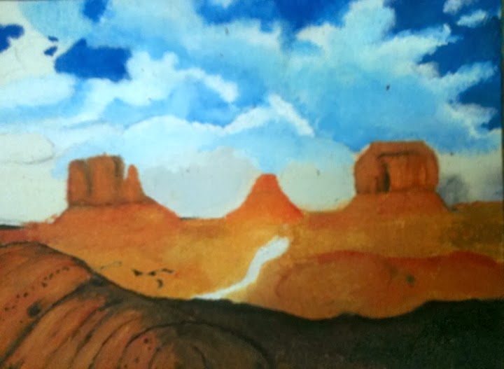
Introduction to Oil Painting- Landscapes

Jarrod Gaines

Evan Barber

Hunter Trunk

Kendra Post
Alyssa Crowley
Mixed-Media Works Inspired by Romare Bearden

Ella Rosenberg

Zach Cassidy

Elizabeth Hemingway

Grey Gaertner

Irina Bridges
Wednesday, January 8, 2014
8-12th Grade Student Work

By: Irina Bridges

By: Ella Rosenberg

By: Paul Venturo

By: Rachel Levi

By: Aaron McPeak

By: Jarod Gaines

By: Steven Hemingway

By: Noah Goode

By: Summer Sipprell

By: Irina Bridges

By: Olivia Tousa